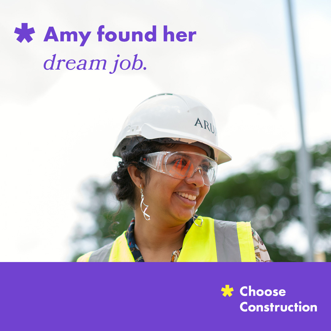
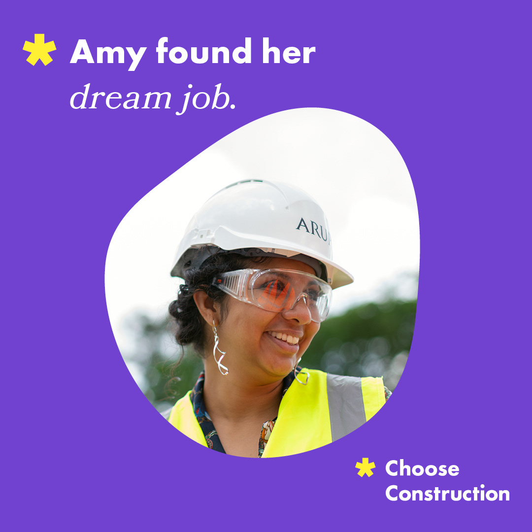
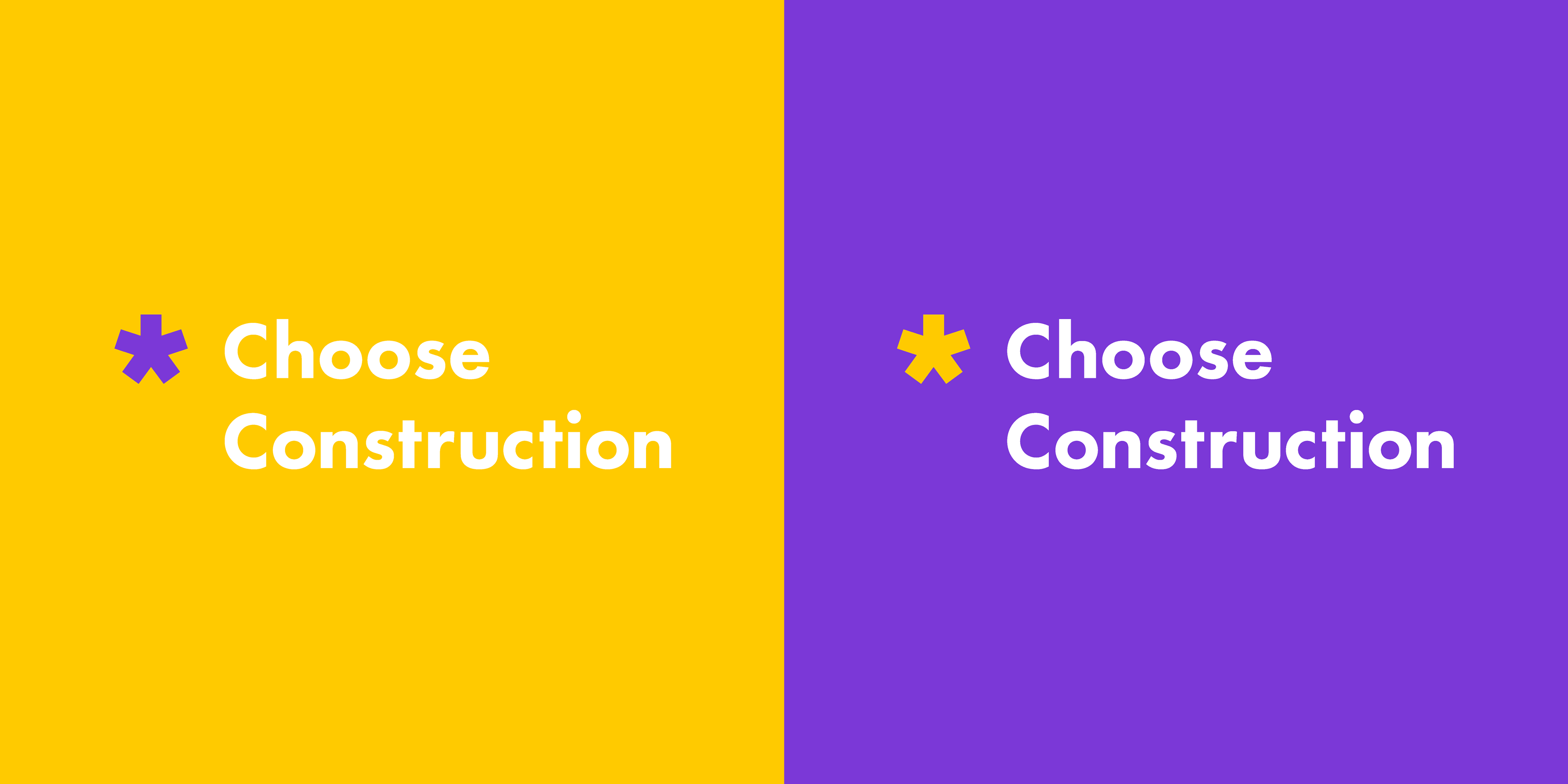
I recognised the social media campaign goal is to showcase the many jobs available in the construction industry. It will be aimed towards diverse individuals and females between the ages of 16-25. I would consider this range as Gen-Z, so I knew I wanted to include 'Gen-Z yellow' in the design process. The purple also compliments the yellow. Since the industry might seem intimidating, I chose a sans-serif typeface to come across as friendly but not overly feminine. The logo mark is an asterisk which I believe resembles a cog but again, wanted to come across as simple, and friendly. It also represents a call to action or attention to the lack of representation in the industry.